
Case Study: Online Repair Service
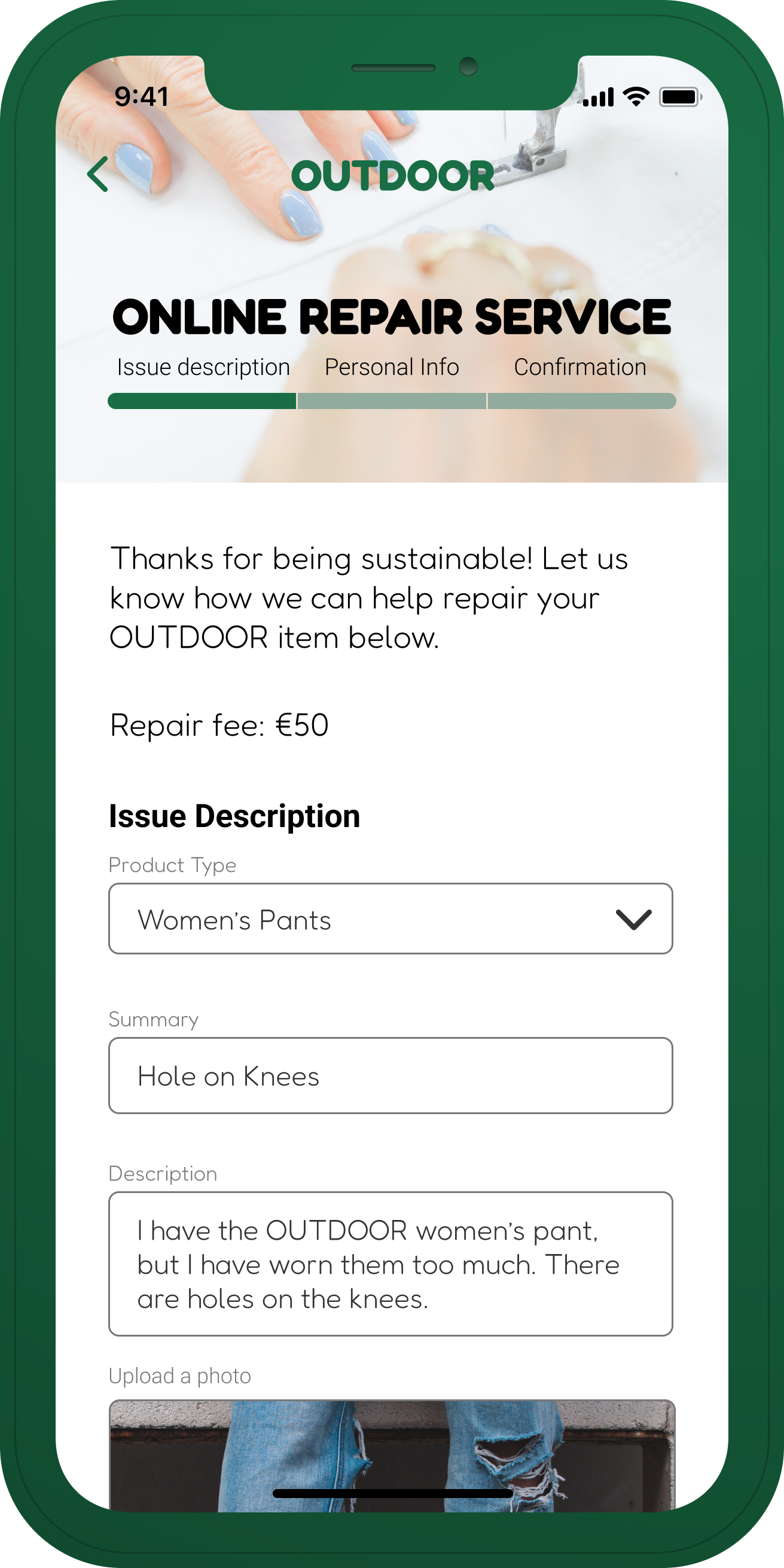
In this case study, the focus is on the sustainability of a high-end e-commerce brand. The aim is to move away from the traditional approach of discarding old and damaged products and instead offer a digital repair service. Through this service, customers can utilize their lifetime warranty to conveniently repair their products at home. To initiate the repair process, the customer fills out a simple form and receives a shipping bag and return label. Once the repair is complete, the item is sent back to the customer, fully restored and ready for use.
It is important to note that the case study is based on several assumptions and innovative ideas, and the prototype presented showcases only the optimal scenario. This feedback session serves as an opportunity to discuss the primary concepts before proceeding to further development, exploring alternative flows, and considering potential edge case scenarios.
Client: Personal Project
Type: UI/UX Design & Branding
Date: January 2022
Case – Digital repair service
In this case study, I will examine how a high-end e-commerce brand can leverage its commitment to sustainability and lifetime warranty in an innovative manner.
Background
This brand has earned a reputation for delivering products of superior quality that are designed with repairability in mind. However, the current repair process lacks digital capabilities, and the user experience is suboptimal, with inconsistent communication.
Task
The goal is to develop a repair service concept that motivates customers to embrace sustainability by utilizing a professional service. This new service should offer a digital interface that improves the user experience, transparency, and affordability of the repair process.
Boundaries
It is important to note that this task is based on creative ideas and assumptions only.
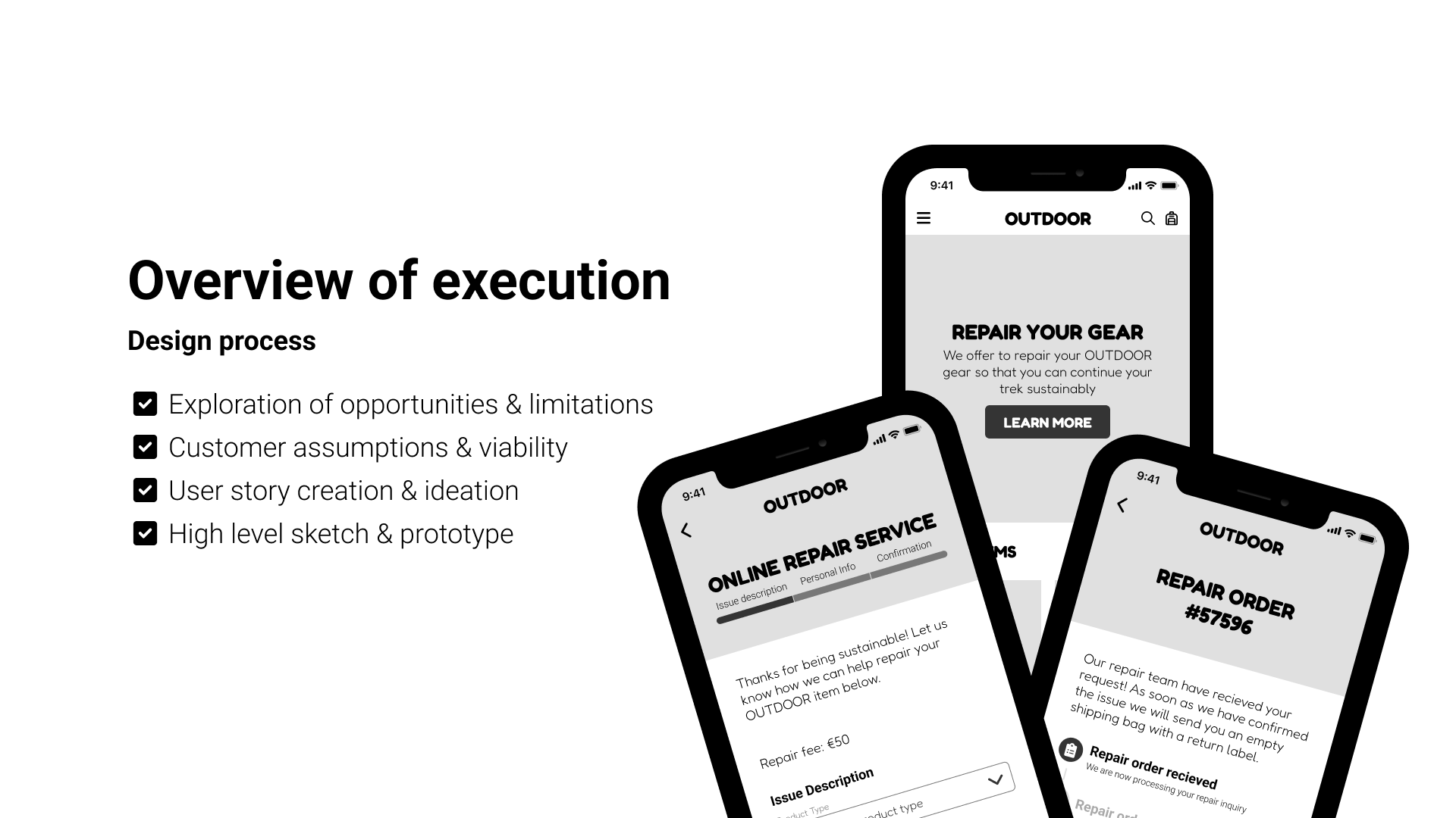
Opportunities & Limitations
Introducing a digital repair service for this brand presents a valuable opportunity to strengthen customer loyalty and commitment. By demonstrating our commitment to sustainability and customer care, we can enhance customer satisfaction. Furthermore, with an increasing number of our target audience residing in rural areas*, offering a digital solution is imperative for the brand’s future success.
However, there are potential challenges to consider, such as the current manual review process. A staff member currently needs to manually review customer repair requests and request further information or images if necessary. While offering a more accessible repair service is desirable, the question arises as to how long it will take to complete the repair process and whether the company has sufficient personnel to support it. Additionally, there is a possibility that certain items may be irreparable, leading to customer disappointment if their repair request is declined.
*Danny Gavin, “THE RURAL MIGRATION TREND”
Assumptions
The brand has introduced a repair service that allows users to send in their damaged or used items for repair instead of disposing of them and spending excessive amounts on new products.
- Customers see the value in repairing rather than spending their money on new items.
- Customers value sustainability and may want to pursue a zero-waste life style.
- Customers are unknowledgeable about this digital repair service.
- Customers are scared of the hassle of shipping their items to be repaired.
- Customers don’t want to pay for extra shipping.
- Most customers don’t live in a big city where repair shops are easily accessable.
- Customers are OK with paying €50 for this service, rather than buying a whole new product.
User story deep dive
I have written the user stories based on
the assumptions.
Who – What – Why
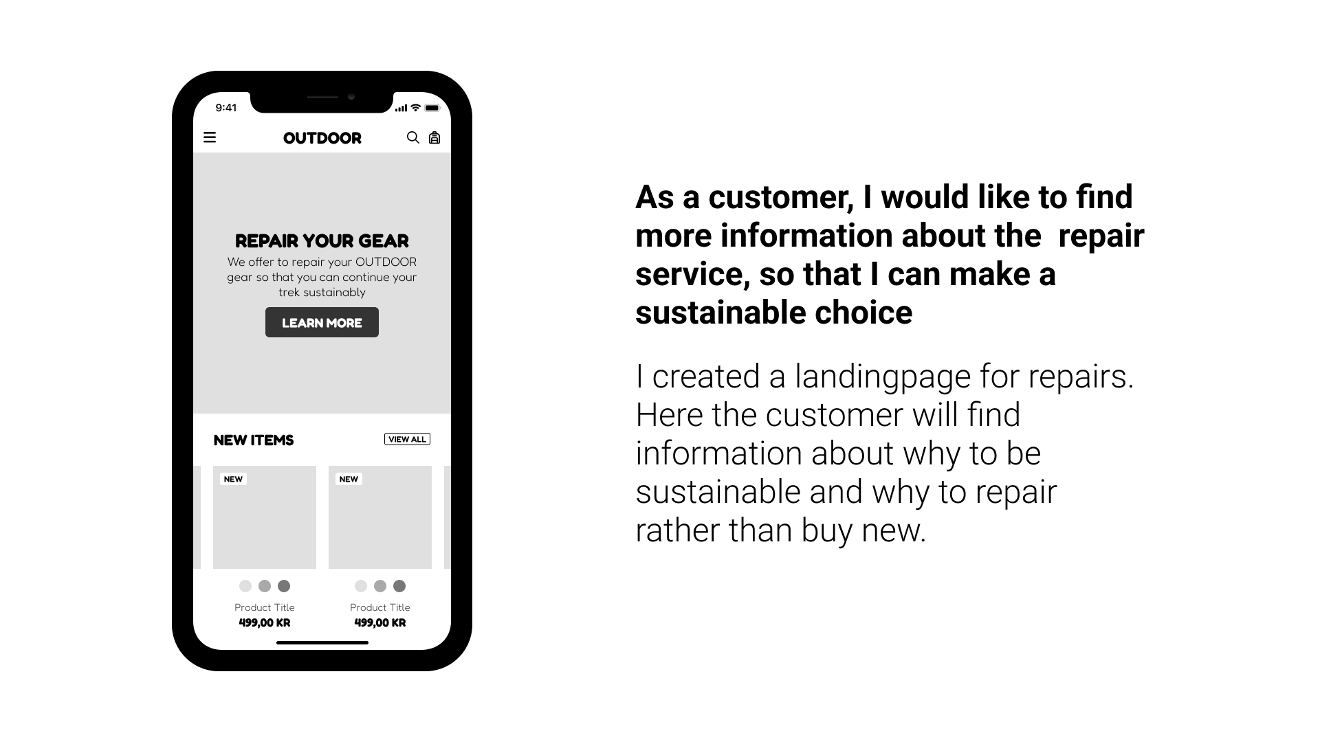
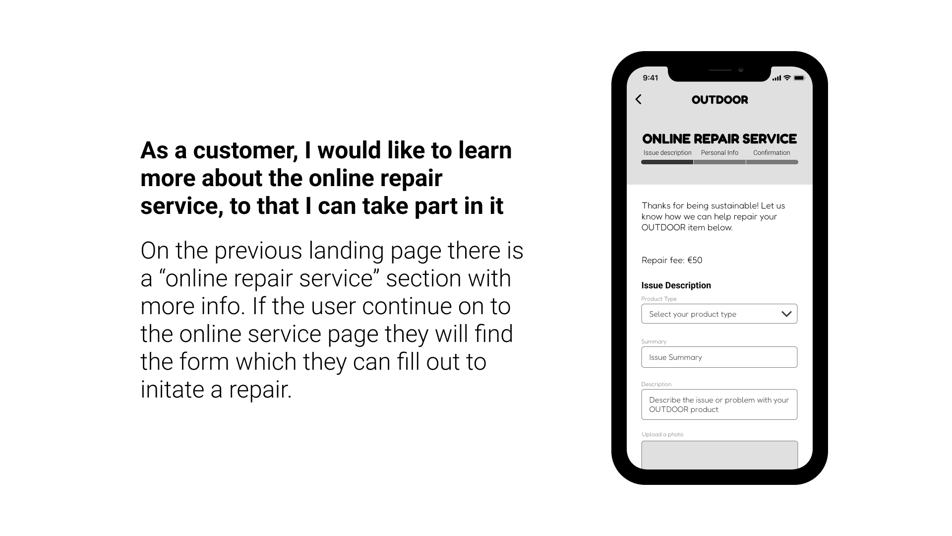

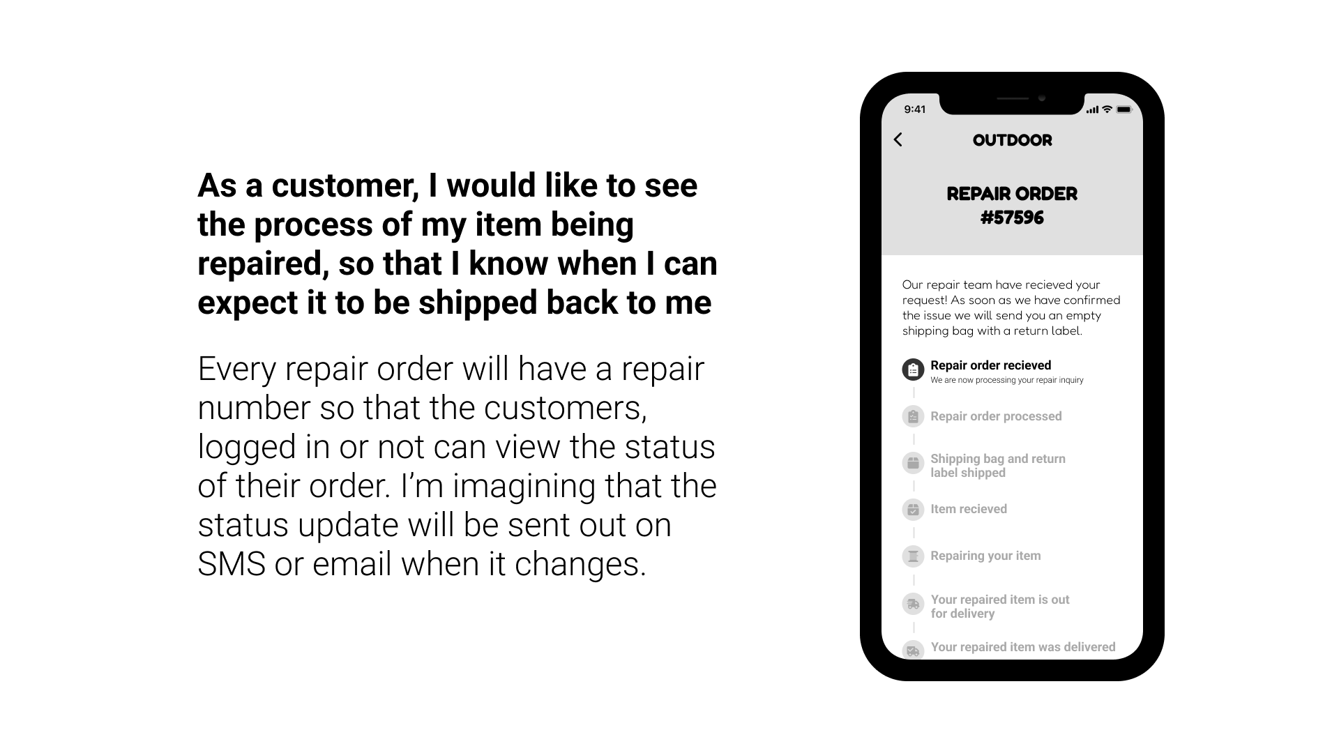

Please click through the prototype
Figma & Design System
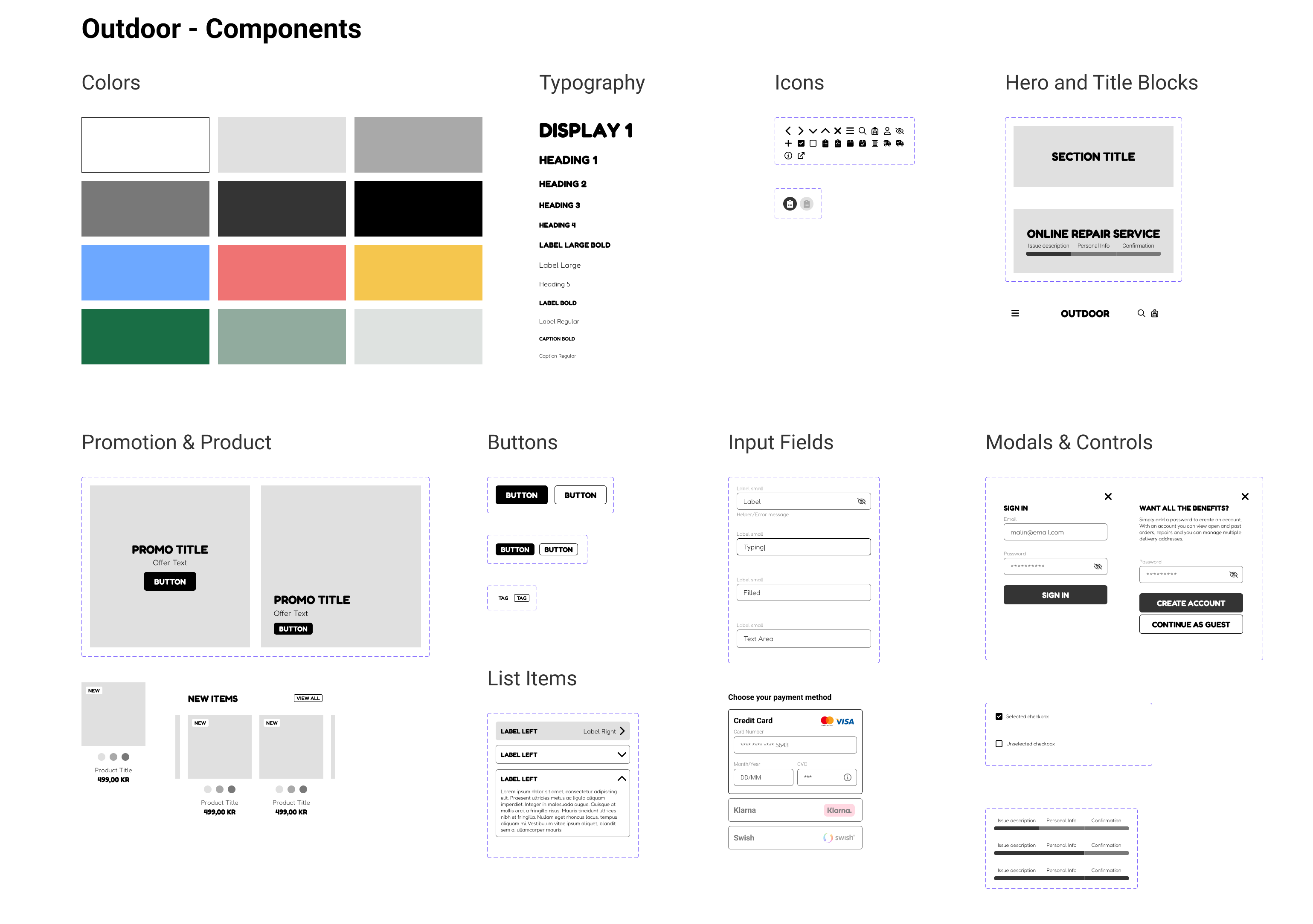
I utilized the Figma software tool to develop wireframes and a prototype. To maintain organization and consistency throughout the design process, I created a streamlined design system that ensures all components and screens are consistent and easily modifiable.
By implementing a cohesive design system, making changes on-the-fly is seamless, and branding the final product is straightforward. As a product designer, establishing a robust design system is a fundamental aspect of producing quality work.
Branding
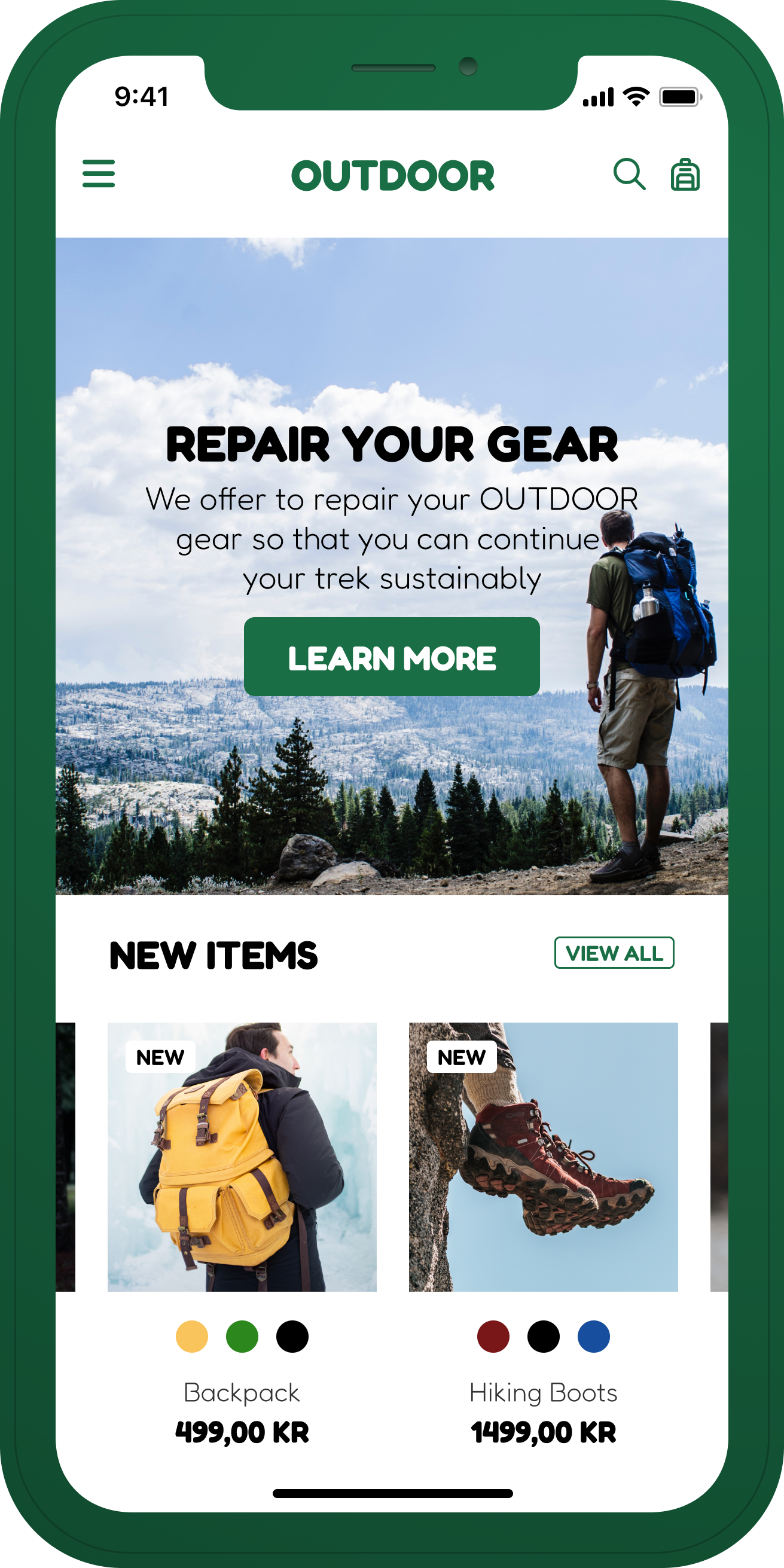
For the branding of this outdoor brand, I opted for a minimalist color scheme of white and green. Utilizing images of the brand in action conveys its active nature, as opposed to static studio shots. Below are several examples of what the branding for this outdoor brand could look like.

Conclusion
After conducting this case study, it’s clear that the users of this brand prioritize both convenience and sustainability. As a result, it was essential to develop a user-friendly digital product that could be accessed from the comfort of their own homes. While I believe that this solution is a solid starting point, if this were a real project, I would seek feedback from my design team and stakeholders to refine and iterate upon the concept.
I would love to hear your thoughts on this case study, so please feel free to leave your comments below. 🙂
