Quick Deposit
As a product designer at an iGaming company, my goal was to increase deposits by providing a seamless experience for users to quickly deposit money during their in-game sessions without interrupting their gameplay. To achieve this, I designed a “Quick Deposit” feature that would allow users to add funds to their accounts quickly and efficiently.
Client: ComeOn Group
Type: UI/UX Design & Branding
Date: January 2023
Research
To start the design process, I conducted research on our competitors and their own deposit features to gain insight into what worked well and what could be improved upon. I also gathered feedback from fellow designers, developers, stakeholders, and the business to better understand their expectations and goals for the feature.
Ideation & Creation
Based on my research and feedback my task was to find a solution to a problem faced by mobile users playing slots games. These users needed to exit the game in order to deposit more money into their account, resulting in the loss of their game session. To address this, I created this user story:
“As a player, I want to quickly deposit, so that I can continue playing the game”
User Story
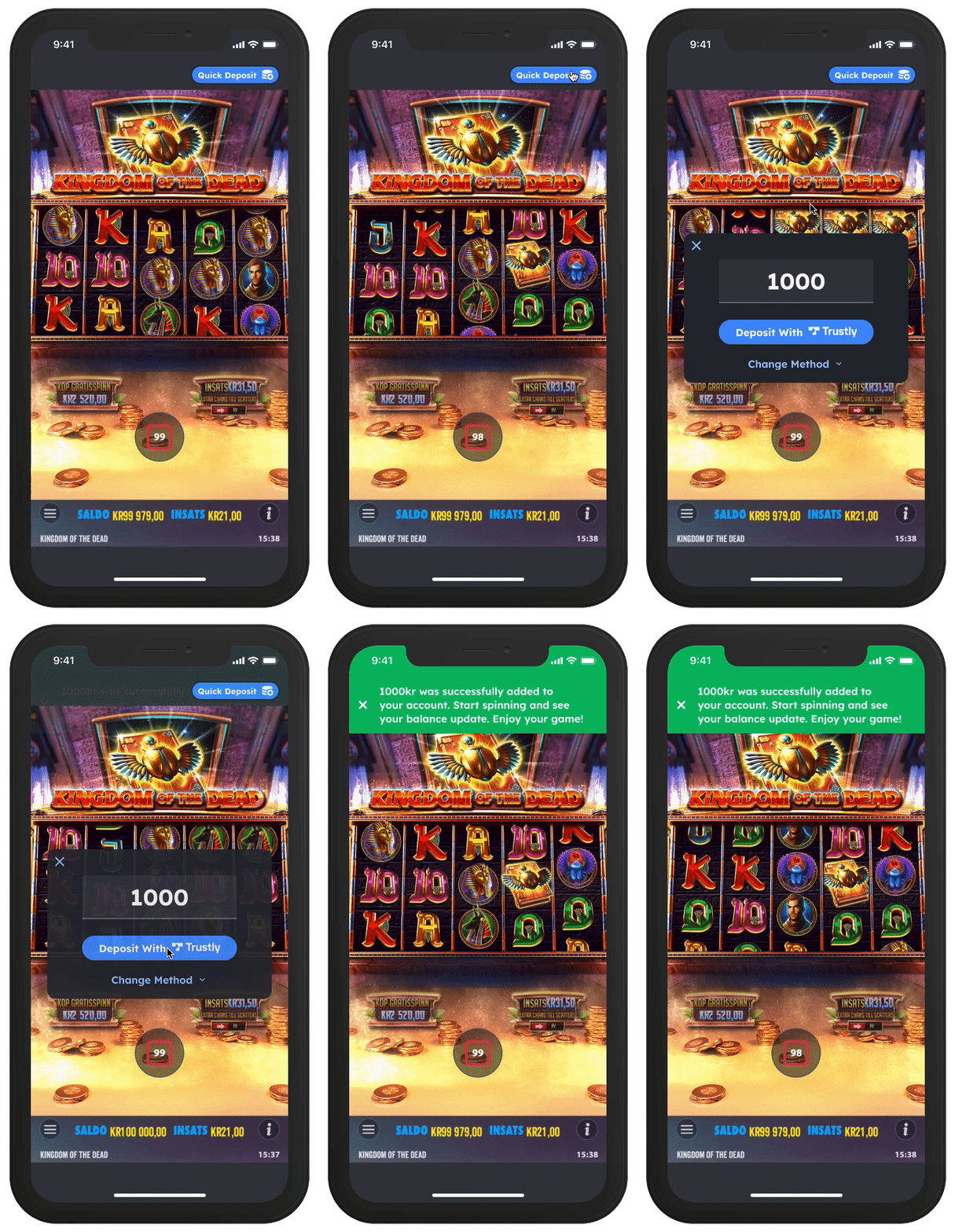
In the initial stages of the project, I conceptualized a solution to the problem we faced. My idea was to design a toolbar that would appear above the game on the mobile screen, featuring a “Quick Deposit” button that would allow users to add funds to their accounts without having to leave the game session.
To make the “Quick Deposit” button easily identifiable, I made sure to use the brand’s color palette and selected an icon that conveyed its function. Through extensive A/B testing, I tested various versions of the button, including different icons, text, and button colors, to find the most effective design. By doing so, I was able to identify the version of the button that resulted in the highest engagement and conversion rate.


Once the user clicks the “quick deposit” button, a pop-up window appears above the game, allowing them to deposit money without losing their game session. In this pop-up window, the user’s latest deposit amount and method are pre-filled, and they only need to click the “deposit” button to continue playing their favorite slot game.
I used the software tool Figma for ideation, sketching, wireframing, prototyping, and UI design of the final version which was used as the hand-over tool for the development team.
The Results
The implementation of the “Quick Deposit” feature proved to be successful in achieving the project goal of increasing deposits and improving the user experience for mobile players. The feature showed remarkable results, increasing deposits significantly, both in engagement and conversion rate.
These results exceeded the expectations of the business and demonstrated the value of user-centered design in improving the bottom line. The success of the “Quick Deposit” feature highlighted the importance of designing intuitive and efficient features that cater to the needs of the target audience.
Moving forward, I am excited to explore further tweaks to the feature and continue to work closely with the development team to optimize the feature’s performance and increase revenue for the business.
