Profile Page Update
As a product designer for an iGaming company, my goal is to keep our websites and apps looking top-notch. When I noticed our profile page wasn’t up to par, I took it upon myself to give it a modern makeover. In this project, you will follow me as I transform the profile page into a sleek and user-friendly screen, adding some fun gamification to an else dull screen.
Client: ComeOn Group
Type: UI/UX Design & Branding
Date: May 2023
Old Design
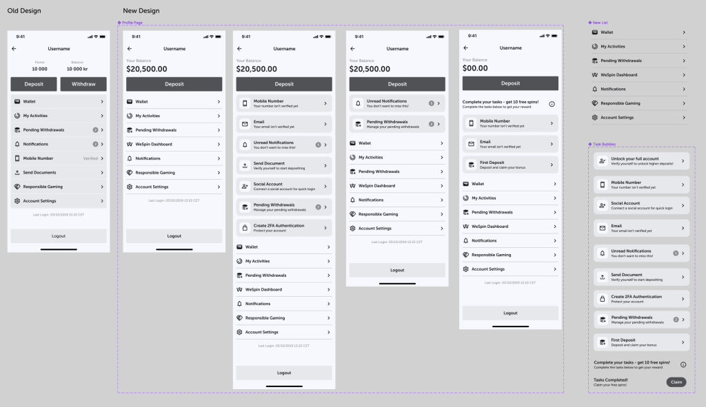
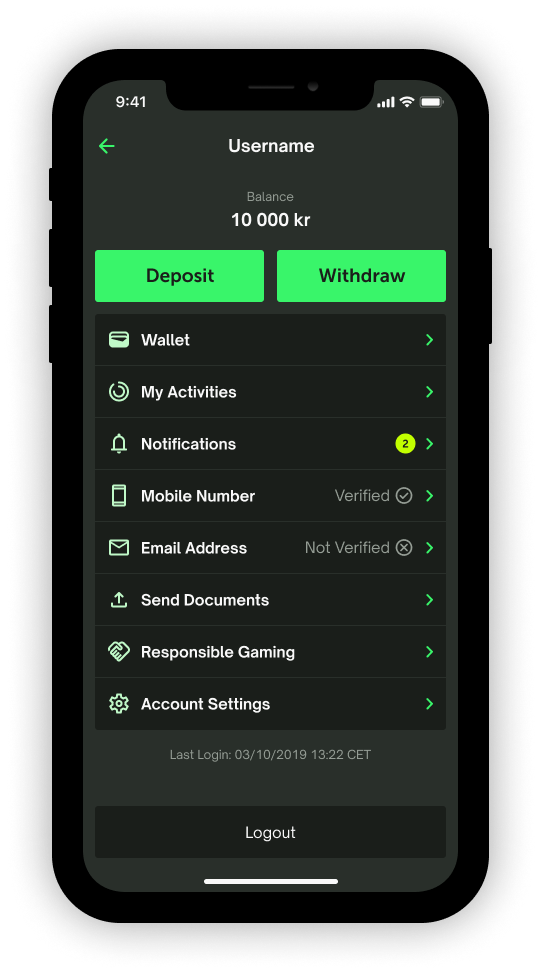
Examining the old profile page reveals a host of issues. Given our focus on user deposits for gaming revenue, it raises questions about the prominence of the withdrawal button compared to the deposit button. Shouldn’t we consider relocating it? Additionally, the list appears chaotic and disorganized, lacking any discernible order or logic. Despite the importance of notifications, their placement far down the list, albeit highlighted with a yellow circle, makes them challenging to locate. The duplication of icons for mobile number and email address verifications strikes me as peculiar. Lastly, once a user is validated, why keep this field in the main profile page list?
New Design
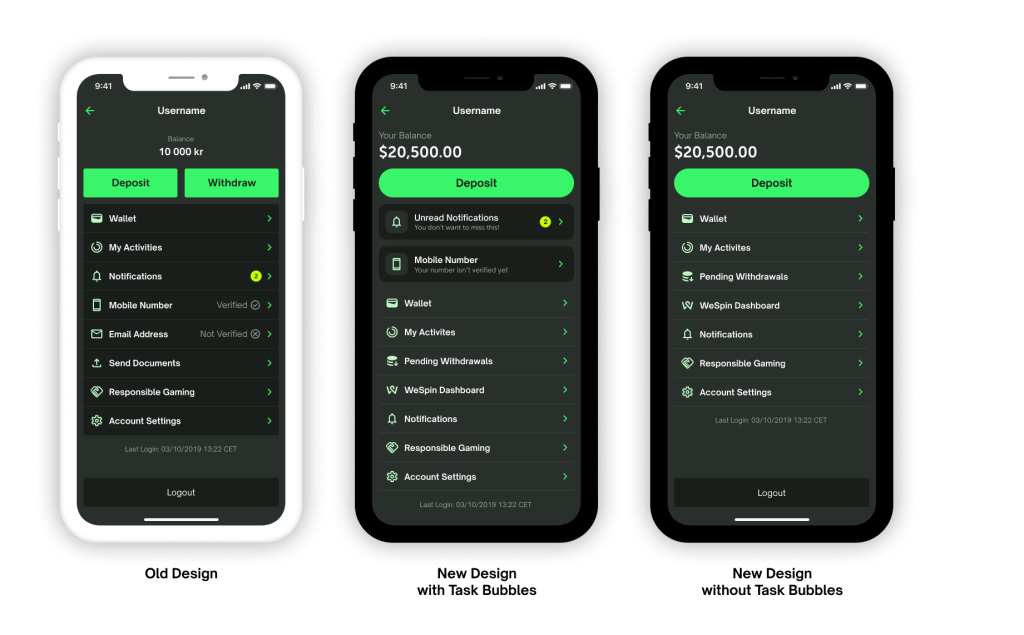
With the updated design, I incorporated a larger font for the balance to enhance clarity and visibility. I also moved the withdrawal button to the “wallet” page, keeping payment-related items in the same space. Additionally, I organized numerous items in the list into categories, aiming to achieve a cleaner and more structured design.
Introducing a notable feature in the form of “Task Bubbles,” positioned strategically between the deposit button and the list, is a key addition to the new design. These actionable items serve to highlight specific tasks for the user. In the current screen, for instance, the user has unread notifications and an outstanding phone number verification task. Once these tasks are completed, the task bubbles dynamically disappear, contributing to a streamlined and uncluttered appearance on the profile page.
Gamification
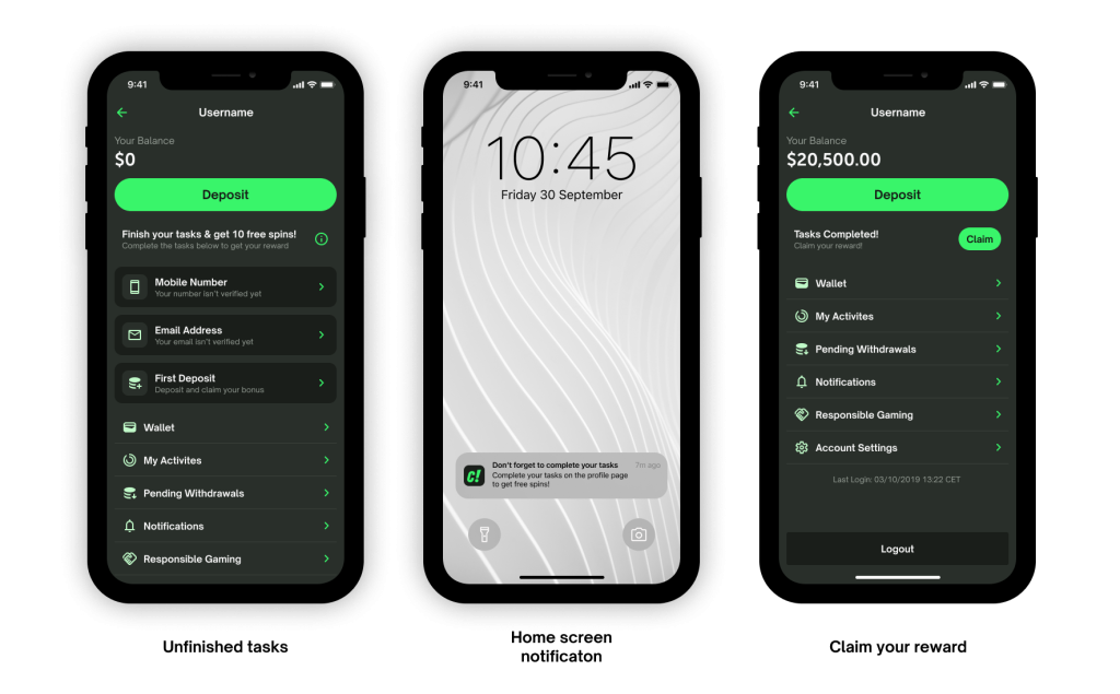
How can we elevate this screen to ensure users not only complete essential tasks like verification and notification checks but also find it engaging? These were the questions that sparked my decision to infuse a gamified element into the page. Imagine offering users a rewarding incentive for completing tasks—a win-win.
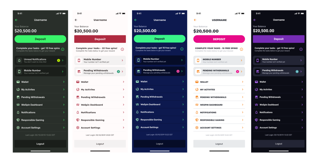
Picture this: a dedicated section positioned above the task bubbles, enticing users with the promise of, let’s say, 10 free spins for any game upon task completion. In the instance presented, we have a newly registered player awaiting the finalization of their mobile number, email address, and first deposit. Furthermore, we could send the user a notification on their phones’ home screen that there’s a task to complete. This not only enhances user interaction but also introduces an element of excitement and immediate gratification, creating a more enticing and enjoyable user experience.
UX work & UI examples
