Welcome Screen Update
As a product designer for an iGaming company, my goal is to keep our websites and apps looking top-notch. When I noticed our Welcome Screen for Sweden wasn’t up to par, I took it upon myself to give it a modern makeover. In this project, you will follow me as I transform the Welcome Screen into a sleek and user-friendly pop-up screen, adding a self-closing logic.
Client: ComeOn Group
Type: UI/UX Design & Branding
Date: September 2023
Background
In line with Swedish igaming rules, our welcome screen always shows users their deposit limits when they log in. Deposit Limit is the max amount players can deposit. We make sure players know these limits every time they log in, keeping things clear and straightforward.
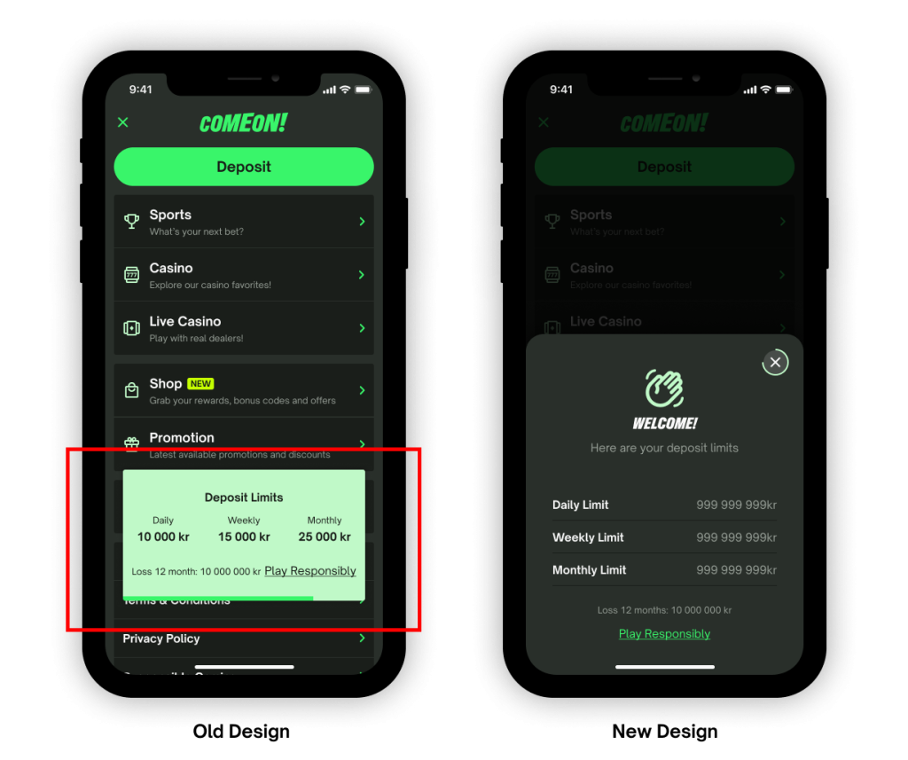
Old Design VS New Design
In the old design, there was a small green box at the bottom of the page. Unfortunately, it lacked a closing function, meaning users couldn’t manually close it but had to wait for it to close automatically after 7 seconds. This could be quite irritating for users, especially since it appeared every time they logged in. Additionally, the user interface was not aesthetically pleasing, contributing to a less-than-optimal user experience.
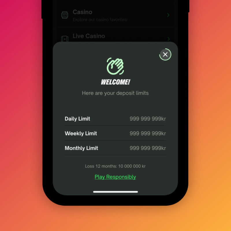
In the new design, we’ve significantly enhanced the welcome screen, making it cleaner and more visually appealing. While retaining the automatic closing function after 7 seconds, we’ve introduced a manual close option for users who prefer a quicker interaction. The incorporation of a bottom sheet design adds a modern touch, smoothly emerging from the bottom and contributing to an overall improved look and feel. Additionally, we’ve addressed the issue of information density, providing more breathing space for a more comfortable user experience.


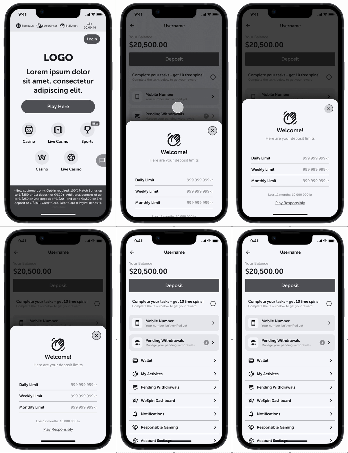
Wireframe Prototype
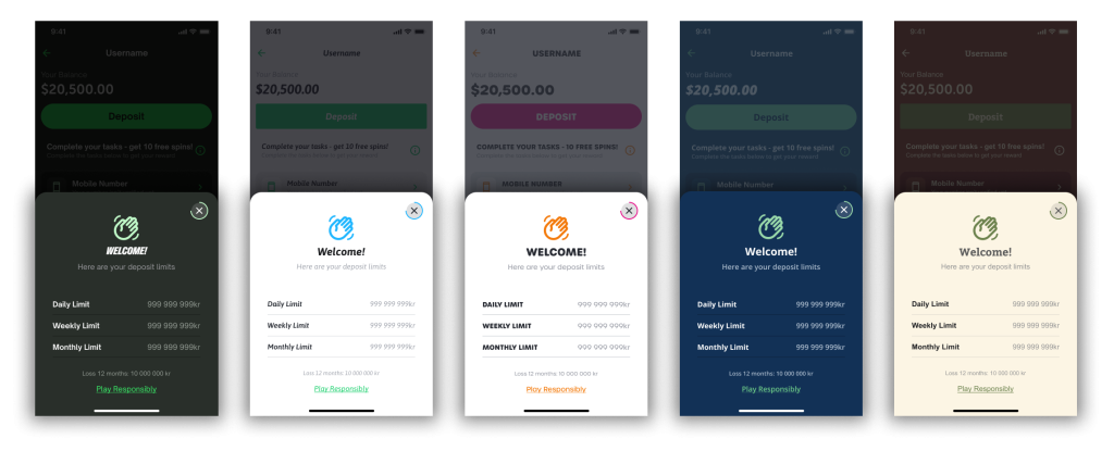
UI examples

